Imagine your company uses a subscription-based service model, and you’d like to increase the number of signups on your website. But right now, they’re far too low! You might consider auditing your website analytics, or wish to perform some user testing to address some of the concerns.
Both methods are great at building out a story of user behaviour and a better understanding of how interaction occurs across your core pages. The insights gained can be further enhanced with the addition of heatmap tracking on your website.
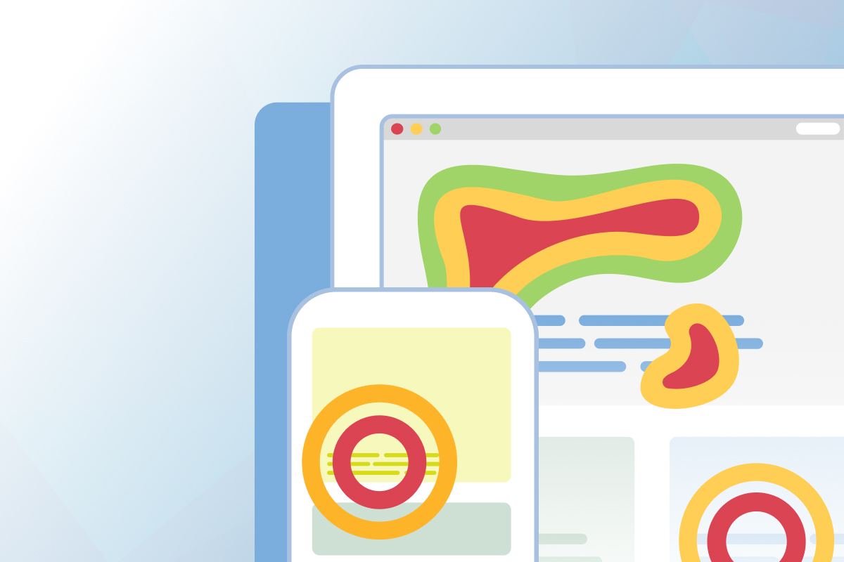
What is a heatmap?
A heatmap is a visual representation of user behaviour data that is colour-coded to indicate areas of intensity across a web page. In this context, a heatmap tool allows you to understand how users interact with your website by tracking behaviours like mouse movements, clicks, and scroll behaviour.
Outlining the data output
Colour-coding
The colours used by a heatmap indicate the intensity of user engagement with specific areas on a webpage. Generally, warmer colours like red and orange indicate zones of stronger interaction, while blues and greens may indicate less interaction. The intensity of zones may also be represented by the size of the colour mapping in some instances.

Mouse movements
Heatmaps also track the paths of a user’s mouse movement across the page, indicating areas where they hover, linger, or where they move quickly. Scanning this metric can show areas that are grabbing user interest.

Click rates
The click rates (or tap rates for mobile users) are often indicated by colour-coded circles on a heatmap, showing the different elements that users are engaging with on screen. These might be buttons, links, or even menu items. Knowing where a user clicks can signal how they interpret the page and what they feel their next interaction should be. It can also indicate areas that are being ignored on a page.

Scroll behaviour
Heatmaps can also track how far down page users are scrolling, which can signal how much of the page content the general user base is absorbing. Where users begin to drop off can often signal patterns in the design or information flow that might be causing users to bounce or lose interest.

By analyzing these metrics, you can gain insight into how users engage with your website, identify areas of high and low engagement, and make data-driven decisions to improve user experience and conversion rates.
Why should UX researchers use heatmaps?
Heatmaps are an effective way to understand user behaviour through a visual medium. The primary benefits and reasons that UX researchers tend to favour these during their research are:
- Identifying popular vs unpopular areas – Heatmaps provide a quick snapshot of what is happening on a webpage, which areas are attracting attention, and which spots are often overlooked by visitors. This information can signal where to optimize content and where to best place an element so that it receives more attention.
- Opportunities to improve the user experience – Behaviour patterns can be revealed by analyzing the scroll rates, click rates, and mouse movement patterns. By understanding these patterns, we can better identify and fix usability issues to improve the experience.
- Ability to track user engagement – Understanding what elements receive the most clicks can help website owners better track engagement across a website. This can signal what types of content to optimize or what content resonates the most with the target audience.
- Increase conversion rates – By analyzing behaviour, we can also identify where users tend to drop off or fail to convert. Heatmaps pinpoint these areas in the user flow so that we can optimize to improve conversion rates.
- Better testing for design changes – Heatmaps are also helpful when looking to validate or test different design changes when looking to gauge the impact on user behaviour. By comparing heatmap data before and after a change, we can determine whether the changes have had a positive or negative effect.
Overall, heatmaps are a valuable tool for gaining insight into user behaviour and creating a plan for optimizing when aiming to improve user engagement, experience, and conversion rates.
What heatmap tool should I use?
There are several heatmap tracking tools on the market today, and choosing the right one will depend on what you need from the tool, a budget you can work with, and the features that help you better analyze your data.

HotJar
Hotjar is an analytics and feedback platform that helps businesses optimize their website by providing insights into user behaviour through heatmaps, session recordings, and surveys. Free plans are available that capture upt 1,050 sessions monthly.
Key Features:
- Heatmap tracking
- Recordings
- Feedback & Surveys
- Automated Session Capture
Crazy Egg
Crazy Egg is a web analytics tool that uses heatmaps and click-tracking to improve website user experience and increase conversions. Its A/B testing and personalization features enable businesses to test and deliver customized experiences. No free plan is available, but packages are available with a 30-day free trial.
Key Features:
- Heatmap tracking
- Recordings
- A/B Testing
- Surveys
Mouseflow
Mouseflow is a web analytics tool that provides insights into user behaviour through session replay, heatmaps, and funnels. Its feedback and survey features help businesses collect and analyze user feedback, and its optimization tools increase website conversions. Free plans are available that capture unlimited page views.
Key Features:
- Heatmap tracking
- Session replays
- User feedback
- Conversion funnels
Microsoft Clarity
Microsoft Clarity is a web analytics tool that captures data like heatmaps, session recording, and advanced insights. It is completely free to use with no feature limit, regardless of traffic volume.
Key Features:
- Heatmap tracking
- Session recordings
- GDPR compliant
- Direct integration with Google Analytics
You can find additional information about the above tools and others, compare their details, and more at this link.

Heatmaps 101 – Common Tips & Tricks
When analyzing your heatmap data, common patterns can hint at user experience problems. While these are not always conclusive, taking note of the following issues and solutions might benefit you.
Keep in mind that heatmaps help tell a part of the story but recognizing data points or testing with real users will further build or prove your theories.
User scroll issues
Common Issue: Users are not scrolling beyond the hero image on my website
If users are failing to scroll down your webpage and dropping off almost immediately, you may want to consider the items that exist above the fold.
- Are the menu labels clear, and do they provide users with a next step?
- Is there an actionable CTA button to click?
- Is the initial content engaging, and what a user might expect when they reach your webpage?
Common Issue: Users don’t scroll to the bottom of my webpage
While this is not an uncommon problem, most of us would like users to digest the entirety of our webpage and its content. Consider the following:
- Are users dropping off at a certain part of the page? This could signal that your page layout is ineffective or the page content is not engaging as the user scrolls down.
- Are users finding what they need early on in the page and reaching higher value inner pages? This could actually be a positive thing.
- Are content blocks too lengthy on your page? Are visual components repeating too often? Is the mobile experience too bloated with information?
Mouse movement issues
Common Issue: Users don’t seem to scan certain page elements
Not everything on a webpage will be treated with the same amount of attention, but understanding what users do show interest in can build a story around what you may want to focus more attention on promoting. If you really want items to attract interest:
- Ensure that higher-value items are higher up on the page.
- Use attractive language, visuals, and white space to help readers find the element.
- Consider movement or animation to bring more focus to specific areas of interest.
User click issues
Common Issue: Users are not clicking the primary CTA buttons
You may notice that the buttons and hyperlinks that should be driving traffic are not receiving any interaction. Consider the following reasons:
- The buttons are too low on the page or are not positioned in a way that inspires the user to take the next step.
- The link labelling is not engaging or is not appropriate for the user’s intention. Consider action-oriented language here, like “Download the Guide” or “Book Now”.
- There are too many competing elements on the page.
- The user has no incentive to click the button or link.
Common Issue: User actions are not matching my expectations
While we may have certain expectations for user behaviour on a website, it’s important to acknowledge that there may be reasons why users exhibit different patterns than anticipated. For example, they may focus on a specific menu item or visit an unexpected area of the website. In such cases, it’s important to consider the following:
- The user may have different motivations or needs than you anticipated.
- The user may have made a decision they felt was correct but were led astray by confusing labels or options.
- The page layouts were difficult to navigate, or the content was not engaging.
As you dive into the data around heatmap tracking, you’re likely to encounter various scenarios and data points. Recognizing typical trends and patterns can help you identify user experience issues and improve outcomes across your website.
How can seoplus+ help you?
If you’re looking for support with UX auditing, user testing, and strengthening the user experience of your website, reach out to us – we’d be happy to help your website grow!
Browse our website and learn more about UX design here.