Posted by
Shay Harel
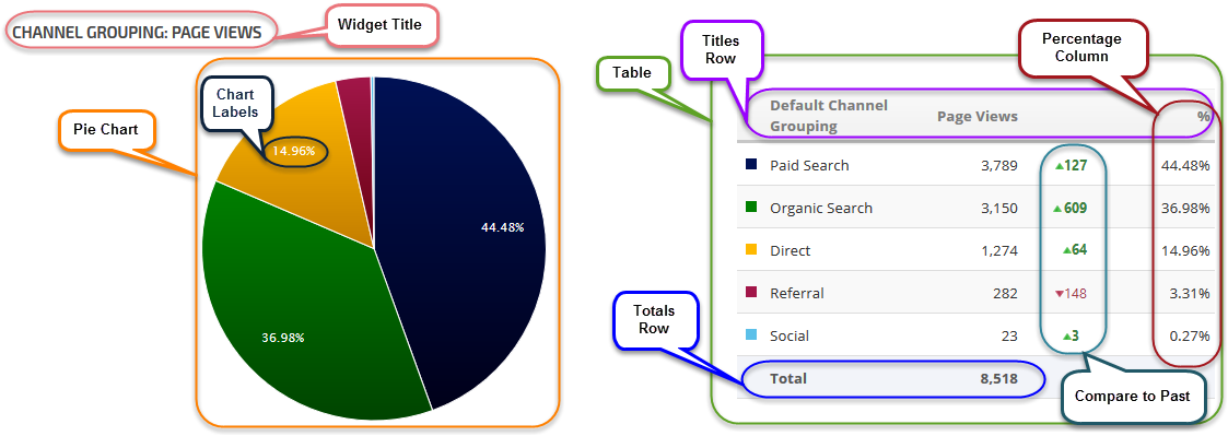
Comparing Google Analytics data just took on new meaning with the release of Rank Ranger’s Google Analytics Pie Chart/List widget. We’re excited to offer this new and innovative widget that will undoubtedly change the way you see and compare Analytics data.
A Picture is Worth a Thousand Words
Our Google Analytics Pie Chart/List widget makes relevant the old saying, “a picture is worth a thousand words.” Getting a quick aggregate snapshot of your analytics is harder than it sounds. Fact is, the task can be downright benumbing. That’s why our new widget enables you to present a global view of your analytics with the blink of an eye, literally.
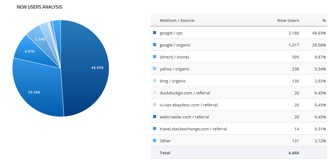
Say then you wanted to determine the medium and source of your new users, all you need to do is select “New Users” as your Key Metric and “Medium/Source” as your Dimension and you’re good to go; your graphically enhanced pie chart breaks down the new users by medium/source while attaching a percentage value to each. The color accented list also displays the selected dimension and key metric with a numerical value and optional percentage. Within seconds, easily interpretable analytic data presented in a friendly graphic layout is at your disposal.
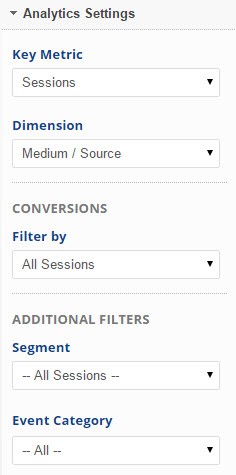
The Google Analytics Pie Chart/List widget enables you to access all of the Key Metrics and Dimensions available via Google Analytics, including any custom segments or events you’ve created.
 As such, some of the available Key Metrics include:
- Sessions
- Bounces
- Hits
- Users
- New Users
- Page Views
- Bounce Rate
- Goal Completions
- Transactions
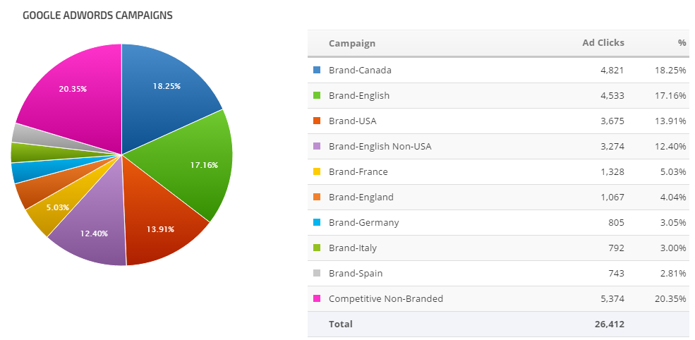
- Ad Clicks
- and many more
The accessible Dimensions consist of:
- Campaign
- Default Channel Grouping
- Medium
- Medium/Source
- Source
- Keyword
- Landing Page Path
- Social Network
- and more
Filter your data via Conversions (e.g., Engaged User, Page/Visit, Time on Site, etc.), Segments (e.g., Android Traffic, Direct Traffic, Returning Users, etc.), and Event Categories.
The Google Analytics Pie Chart/List widget offers a complete analytic package without any of the strain of eye and numbness of brain.
==> Find out how to create compelling blog posts using Google Analytics data with our Google Analytics Guide
Search Traffic Comparison
Easily compare analytic data between two periods of time. Say you wanted to compare your new users per source to the same period last year, the Compare to Past function makes doing so an absolute cinch. The comparison data from the previous period is inserted in the table in a neat and easy to read column.
In fact, the Google Analytics Pie Chart/List widget allows you to compare data from a previous period in two dynamic ways:
Data Value Change: By selecting the Data Value option, the numerical change between the two periods is displayed.
Percentage Change: Selecting the Percentage type delivers the changes between the two periods as an increasing or decreasing percentage.
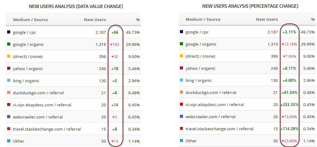
In either format, the new Google Analytics Pie Chart/List widget creates a quick and simple way to compare analytic data between two customizable periods.
Customization Compatible
 The beauty of the widget (other than its aesthetically pleasing, user-friendly, and unique ability to compare complex data) is its flexibility.
Imagine your biggest client calls and wants to see a report comparing the traffic sources to their site from this year to last.
Want to include percentages on the pie chart itself? By all means. Don’t want to? Simply hide them.
Feel the need to add supplemental information? Add a text box to your PDF report.
Maybe you’re sending a report to a client who doesn’t like to be bombarded with too much information, simply limit the number of results, hide a report column or row, show only the pie chart or only the list – whatever works best for you.
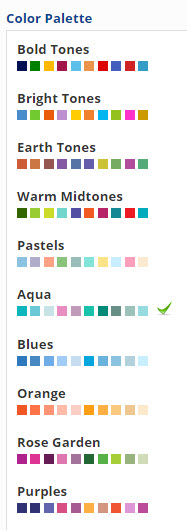
Even the appearance of the widget per se is under your control. Perhaps you want the list to be prominent, perhaps you want the pie chart to dominate the conversation, either way, their relative scale is in your hands. From bright vibrant colors to pastels, the choice is yours.
We’ve designed this widget knowing full well that your presentation counts for a whole lot and that it can’t be standardized. Being able to show the data from Google Analytics in a user-friendly, appealing, simple, and comprehensible manner should not be underestimated. Truth be told, it can be the difference between effective data presentation and a bunch of random lines followed by a complex series of numbers.
Limitations of the New Analytics Widgets
The Google Analytics Pie Chart / List Widget joins the recently released Analytics Stacked Columns Widget, both of which are limited only by your imagination. I invite you to log in and create some artistic and impressive search traffic graphs with these tools and share them.
Discover how Rank Ranger can enhance your business
All the data in insights you need to dominate the SERPs
About The Author